A lot of initial users in dominKnow | ONE wonder whether they should be working in the Claro mode or the Flow mode.
And like many things, the best answer we can provide is – it depends.


A lot of initial users in dominKnow | ONE wonder whether they should be working in the Claro mode or the Flow mode.
And like many things, the best answer we can provide is – it depends.
Having Claro and Flow reflects the two different ways that web-based content has been designed over time.
In the earliest days of the Internet a computer monitor had a resolution (or dimensions) of 800x600, for example, so that was considered the size of a web page. Designers then arranged content to fit in that space. Designers used tools like Photoshop to create the exact layout of content pages then those designs were handed off to the web development team to be coded.
And this worked great, until we started using devices that didn’t fit the same “page” dimensions. When smart phones first came along most web sites started adding a new “mobile” version that would get shown if you used a smart phone to access the site. But as more and more devices became common, this strategy became a challenge for web designers. How can you successfully create and update multiple versions of a website, now that we have tablets, phablets, watches and even smart TVs?
The idea of Responsive Web Design was first described in 2010. Responsive Web Design creates pages that can detect the width they’re being viewed at and can adjust content layout if needed. Responsive Web Design allows you to create one version of a page and support multiple viewing sizes.
If you’ve spent any time on the Internet in the last few years then you've definitely experienced Responsive Web Design. It often takes advantage of longer scrolling pages, with sections of content using different backgrounds, such as different colors, images or even videos.
Claro and Flow reflect these two different ways of designing and structuring web content.
No matter which mode you work in, all web-based content published out of dominKnow | ONE is HTML5. So both Claro and Flow content can be viewed on desktop and laptop computer screens as well as mobile devices, gaming consoles and more.
Content from both modes can be published as SCORM, AICC, xAPI, standalone web-packages as well as print documentation.
Most of the ways you work in the two modes are the same. You follow the same steps to add a button to a page then connect it to show a Popup alert box or to add labels to an image, for example.
Where Claro and Flow are different is how their respective Pages are structured. And this difference is the biggest factor in deciding which mode to work in.
Claro
Claro is what we call a fixed layout or even fixed pixel approach to page design, the original way that web content was created.
Those are a couple of fancy ways to say that Claro pages have fixed dimensions and the things you add to those pages have specific and fixed locations. If you add an image, for example, it has an X and Y coordinate on the page that is measured in pixels.
And as you add more things to a Claro page, the elements also have a location in terms of layering on the page.
Claro is like working in a PowerPoint page, or even like working in a movie format. It’s also like working in most desktop eLearning authoring tools (many of which are based on PowerPoint).
As we’ve noted, Claro pages are HTML5-based so there’s no issue with them being viewed on a tablet or smart phone as well as a laptop or desktop or being projected on a screen in the board room. Since their dimensions don't change, Claro pages will always have the display dimensions. They’ll just be bigger or smaller depending on the screen real estate available, up to their default size.
Flow
Flow pages are, in our description, truly responsive. Flow is our authoring option for creating content in the same way most modern web sites are created.
Content on Flow pages doesn’t have a specific location because Flow Pages can change based on the width of the screen they are being viewed on. For example, a Flow page can have three content elements in a horizontal row on a wide screen, but switch them to a vertical arrangement on a smaller screen such as a smartphone held in portrait (vertical) mode.
This means Flow content can allow for different user experiences for different screen contexts. It also means page content doesn’t have a fixed location on the page. Something can be in one location on a wide screen and be in a different location on a smaller screen.
Flow pages can also be as long as you need, and it’s easy to use scrolling as an intentional design experience.
The thing to understand is that in order to have this great flexibility, Flow pages are structured in a completely different way than Claro pages. Flow pages are structured as content within a nested grid (kind of like working in tables within tables), and the grid is more complicated than the approach of Claro pages. It also means that you can’t drag and drop content to move it around on the Page – all content is held within the structured grid.
Here's an infographic that offers some more detail on how responsive pages behave.
Well, now we’re back to the “It depends” part of the answer.
Claro and Flow each have different strengths that lend them to different types of projects.
Claro
One of the advantages of Claro’s fixed dimensions is that you can do animation and other similar effects. You can move the parts of a diagram together, for instance, by animating them to move from one location on the page to another.
Here's a game example - Escape the Room - that can only be made in Claro, because Claro has fixed locations for its elements. Those fixed locations are what allows the room image to pan back and forth as you use the slider, for example.
Claro is also a great fit if your content requires on-page content synchronized to voice over narration, like a traditional eLearning course.
Another reason to consider Claro is if you want to import PowerPoint content to get started. (You can’t import PowerPoint into a Flow project, because Flow pages are structured in a completely different way.)
On the other hand...
While Claro content can be viewed without technical issue on a smartphone, what you actually put on the page may or may not be a great experience on a smaller screen. Highly detailed content like small-sized labels on a diagram that are readable on larger screens might be hard to read on a smartphone. Users can always pinch and zoom, but that may not make for a great experience. So keep that design aspect in mind if you know that your Claro content is going to be used on smaller mobile devices.
Flow
The flexibility of Flow pages make it ideal for creating content that can be viewed on any device. So Flow is great for content that needs to serve multiple purposes, say both as an eLearning course plus a searchable Knowledge Base.
Flow is also great if you want to create content that reflects modern web design using scrolling pages as a design experience.
Here's an example of an eLearning lesson created as a single, scrolling page experience. What might take eight pages in "traditional" eLearning or PowerPoint is all gathered in one easy-to-navigate page.
On the other hand...
Since Flow pages don’t have exact locations for content, Flow doesn’t offer the same types of animation strengths that Claro does. You can’t animate an element from one exact location to another, because those exact locations can change and then the animation wouldn’t make any sense.
The ability of Flow pages to change depending on the size they’re being viewed at also poses challenges for two types of content we commonly see in traditional elearning.
If content is synchronized to narration, on a smaller device the learner may not actually see that content – if the page is longer, they could be scrolled to any point on the page. That's why the Timeline feature below the stage is only available for timing to a Narration audio in a Claro project.
And drag and drop activities can be a challenge on smaller screens like mobile devices where the draggable elements and the drop targets might not be viewable at once. Having to drag and scroll at the same time may not be a great experience. Our Rapid Question types include several drag and drop options that have been with responsive design in mind to help solve this, but you may find it an issue if you are using our older Custom Question drag and drop options.
We also find that a user’s previous authoring experience is a factor to consider when choosing which mode to work in.
Users with a web design background typically understand Flow quickly, because they already understand the ideas of responsive web design and how such pages are structured and, as a result, designed.
If you’re coming from a background of only knowing other eLearning tools or even just PowerPoint, Flow can be harder to understand because it is so different than PowerPoint. In this case you really need to start with the basics of Flow and work up from there. Working with other tools teaches you to think in the manner in which those tools work, so learning Flow is really learning a new way of thinking about design.
Think of Claro and Flow as two different languages. You need to understand the grammar of each in order to successfully use them to communicate.
I am using standard bubbles input controls to create 4 options a learner can select to solve the problem. For each input, when the learner click on the bubble, I want the option to change color (e.g green when correct; red when incorrect; yellow to indicate the option could be done but its is not the best choice) and add an action to show the feedback for each option. There is a different feedback response for each option (bubble), not just correct/incorrect. Should I use a variable to cha...

In this episode of IDIODC, Duncan Welder joins to talk about xAPI. He has been building xAPI solutions for a very long time and joins us to share a few examples of "xAPI in the wild".
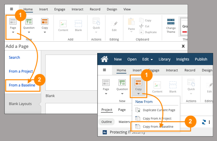
Speed up development time by using Baseline Projects as your own template library

Liza Wisner joined for a wide-ranging conversation including DE&I, Creating Upskilling & Reskilling plans, and more.
I would like to create links from a web page that open a project, but jump to a specific page in the project.

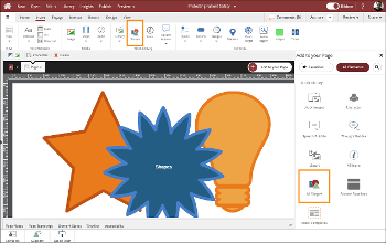
Improve learning and understanding with Shapes as design and decorative details
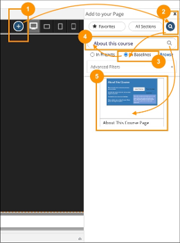
Speed up development time by using Baseline Projects as your own template library for Sections or Layers

The magic of making video is probably in your pocket or even your hand right now.
In this IDIODC episode, Brent shares some really cool tips for using your mobile device to capture video for your learning projects, tips that can help your videos look and sound more professional.
And I totally geeked out at a couple of products he showed off.


Comments ( 0 )
Sign in to join the discussion.